

Ever walked into a room and felt like the walls were screaming at you in hues that clashed louder than an off-key choir? Choosing paint colors can be akin to navigating a minefield of shades. But fear not, for with a few expert tips, you can transform your space into a harmonious sanctuary that speaks to your style and mood. So, how do you ensure each room’s color palette is a perfect symphony of your design dreams?
Understanding Color Psychology
When choosing paint colors for your home, understanding color psychology can play a crucial role in creating the desired atmosphere for each room. Color symbolism and cultural influences have a significant impact on how colors are perceived. For example, in Western cultures, white symbolizes purity and cleanliness, while in some Eastern cultures, it represents mourning. These cultural influences can shape our emotional responses to different colors.
Color perception is also a vital aspect to consider when selecting paint colors. Warm colors like red, orange, and yellow tend to evoke feelings of comfort and energy, making them suitable for living rooms or dining areas where socialization is encouraged. On the other hand, cool colors such as blue, green, and purple are known for their calming and relaxing effects, making them ideal for bedrooms or home offices where a sense of tranquility is desired.
Assessing Natural Lighting
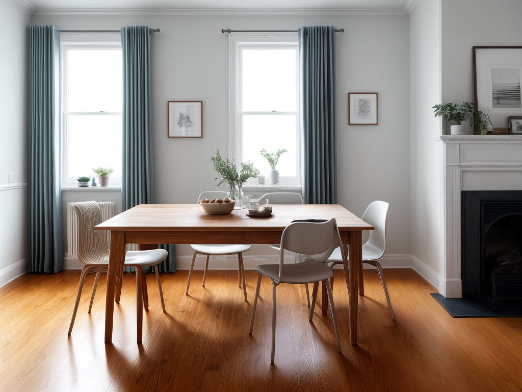
Assessing natural lighting in a room is essential for determining the most suitable paint colors to enhance the space effectively. Understanding how natural light interacts with different hues can help create the desired atmosphere in a room. One crucial aspect to consider is window placement, as it significantly influences the amount and quality of natural light that enters the space. By assessing the natural light available, you can choose paint colors that will complement and make the most of the room’s lighting conditions.
| Natural Light Assessment | Window Placement | Ideal Paint Colors |
|---|---|---|
| Bright and Direct | Windows facing south or west | Light shades to prevent overpowering brightness |
| Soft and Indirect | Windows facing north or east | Warm tones to add coziness and brightness |
| Limited and Shaded | Windows with obstacles blocking light | Bright whites or pale pastels to maximize light reflection |
Considering Room Size
Considering the size of a room is crucial in determining the most suitable paint colors to create an aesthetically pleasing and balanced space. When choosing paint colors based on room size, here are some key factors to keep in mind:
- Furniture Placement: The size and color of your furniture can impact how spacious a room feels. Lighter colors for furniture in a small room can create a sense of openness.
- Wall Texture: The texture of the walls can influence how light interacts with the paint color. Smooth walls reflect light differently compared to textured walls, affecting the perceived size of the room.
- Accent Colors: Utilizing accent colors strategically can help define different areas within a room, especially in larger spaces, creating visual interest without overwhelming the room.
- Ceiling Height: The paint color on the ceiling can visually impact the height of the room. Lighter colors tend to make ceilings appear higher, while darker colors can create a cozier atmosphere.
- Color Flow: Maintaining a cohesive color flow between rooms of varying sizes can help create a harmonious transition throughout your home.
Exploring Different Color Schemes
Exploring various color schemes can significantly impact the overall ambiance and aesthetic of a room, enhancing its visual appeal and creating a cohesive design. Color combinations play a crucial role in setting the mood of a space. By carefully selecting the right color scheme, you can evoke specific emotions and create the desired atmosphere within a room. Here are some popular color schemes and their mood influence:
| Color Scheme | Mood Influence |
|---|---|
| Monochromatic | Creates a harmonious and calming environment. |
| Analogous | Offers a cohesive and comfortable feel. |
| Complementary | Provides a dynamic and vibrant atmosphere. |
| Triadic | Adds visual interest and energy to the room. |
| Neutral | Elicits a sense of sophistication and elegance. |
Each color scheme has its unique characteristics, and understanding how they influence mood can help you choose the perfect palette for your space.
Harmonizing With Existing Decor
To harmonize with existing decor, assess the color palette and style of your furniture and accessories to guide your paint color choices effectively. Understanding the existing elements in your space is crucial to create a cohesive and visually appealing look. Here are some key points to consider for successful color coordination and decor blending:
- Identify Dominant Colors: Determine the primary colors present in your decor to select a paint color that complements them.
- Consider Undertones: Match the undertones of your furniture and accessories with the paint color to ensure a seamless blend.
- Balance Bold Elements: If you have bold decor pieces, choose a paint color that enhances rather than competes with them.
- Create Contrast: Use contrasting colors to highlight specific decor items and add visual interest.
- Seek Inspiration: Look for inspiration in your decor pieces to find a color that ties everything together harmoniously.
Sampling Paint Colors Effectively
When sampling paint colors, it’s crucial to select a variety of color swatches to compare against your existing decor. Consider how lighting can influence the appearance of different hues, and test the samples in various lighting conditions throughout the day to ensure the chosen color looks good in all settings. This method allows for a more accurate representation of how the paint will look in the space, helping to make a confident color choice.
Color Swatch Selection
I find that sampling paint colors effectively through color swatches is crucial in ensuring the perfect hue for each room. When selecting color swatches, consider the following:
- Color balance: Choose a variety of swatches to test in different areas of the room to see how they interact with existing elements.
- Swatch placement: Place the swatches near windows, corners, and next to furniture to observe how natural and artificial light affects the colors.
- Size matters: Opt for larger paint swatches rather than small ones to get a better sense of how the color will look on a larger scale.
- Multiple coats: Apply at least two coats of each color to see how it appears when fully opaque.
- Observe at different times: Take note of how the colors look during different times of the day to ensure you love it in all lighting conditions.
Lighting Considerations
Considering the impact of lighting on paint colors is essential for achieving the desired ambiance in each room. To ensure the color you choose looks just right, take note of the natural light balance in the room. Rooms with ample natural light tend to showcase colors more vibrantly, while rooms with less natural light may benefit from lighter shades to prevent a gloomy feel. Additionally, consider the influence of overhead fixtures. Warm-toned lights can enhance reds, yellows, and oranges, while cooler lights complement blues and greens. By paying attention to these lighting factors, you can select paint colors that harmonize with the room’s lighting conditions, creating a cohesive and inviting space for all to enjoy.
Testing Colors in Various Lighting
When choosing paint colors, it’s crucial to consider how natural light impacts the hues throughout the day. Additionally, artificial lighting plays a significant role in how colors appear in a room, so it’s essential to test shades under different lighting conditions. By understanding how both natural and artificial lighting influence color perception, you can select the perfect paint color that will look great in any lighting setting.
Natural Light Impact
Testing paint colors in various lighting conditions is crucial to ensure the desired effect and ambiance in each room. Natural light plays a significant role in how colors are perceived within a space. Here are some key points to consider when testing paint colors in different natural light settings:
- Morning Light: Colors may appear softer and cooler in morning light.
- Midday Sun: Bright, direct sunlight can amplify warm tones.
- Afternoon Light: Colors tend to look richer and warmer in the afternoon.
- Dusk: Neutral tones may appear more muted during dusk.
- Twilight: Blues and grays can take on a cooler, calming effect in twilight hours.
Understanding how natural light impacts color perception is essential for choosing the right paint colors for your rooms.
Artificial Lighting Considerations
In assessing paint colors for different lighting scenarios, it is essential to factor in the impact of artificial lighting on color perception within a space. When considering artificial lighting, understanding color temperature is crucial. Different light sources emit varying color temperatures, influencing how paint colors appear. Warm light sources, like incandescent bulbs, enhance warm tones in colors, while cool light sources, such as LEDs, can make colors appear crisper and brighter. To accurately test how paint colors will look under artificial lighting, it’s advisable to try samples in the actual space where they will be applied. This hands-on approach allows for a better understanding of how the chosen colors will interact with the artificial lighting, ensuring a harmonious and visually pleasing outcome.
Seeking Professional Advice
To ensure a harmonious color scheme throughout your home, consulting with a professional painter can provide valuable insights and guidance. Expert consultations on color palettes and professional recommendations based on current color trends can make a significant difference in the outcome of your painting project. Here are five reasons why seeking professional advice is beneficial:
- Color Psychology: Professionals can help you select colors that evoke the right emotions and moods for each room.
- Coordination: They can ensure that the colors chosen for each room complement each other seamlessly.
- Lighting Considerations: Professionals understand how different lighting conditions can affect paint colors and can make appropriate recommendations.
- Quality Materials: They can advise on the best paint brands and finishes for a long-lasting and high-quality result.
- Cost-Effective Solutions: Professionals can help you avoid costly mistakes by guiding you towards the most suitable color choices for your home.